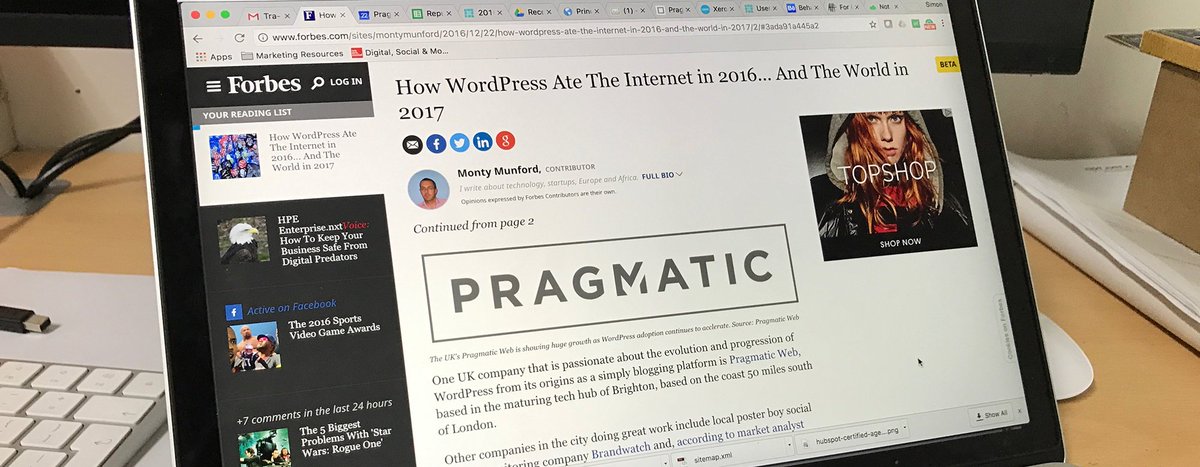
Don’t get me wrong, Pragmatic were due a re-brand. Their previous logo looked as if they were part of a survey tick list…

You can then add your own suggestion as to what that tick list was. “Tick all the companies you don’t like”, or whatever.
Yea, that box is pretty rubbish and the typeface of the company name is pretty boring. The new one, I think, is much better.

And I think their square version, in particular, is the better one…

Did you spot that the tick is now part of the ‘M’? No? Me neither. I just thought it was a cool looking split M. So, yeah, it looks nice but it’s the statement from their ‘Creative Director’ that really needs mention…
Pragmatism is at the core of the new logo concept. Bespoke typography with seamless integration of the tick icon creates something memorable, contemporary and with legacy.
What a load of twaddle. Since working at Automattic what has been truly refreshing is the lack of business-babble (aka ‘office jargon’ and many other alternatives) like this and that people talk straight, without hiding behind cliches and buzzwords.
However, my favourite bit is…
Encasing the typography in a frame gives a further feeling of unity and support, whilst also becoming a tool in the extended brand communications.
It makes me feel genuinely queasy reading that. Seriously, did anybody see the box and, consciously or otherwise, suddenly feel there was greater unity as a result? This is just marketing trying to justify their expenses by making you thinking that drawing a box around some text was more than just something that made it look nice. They couldn’t even integrate the tick without making it unnoticeable!
Which is a shame because, as I say, I like the new logo. They, at least, got that right!

Talk to me!